Scroll through Instagram, TikTok, or X for more than a minute and you’ll notice a déjà‑vu effect: the same pastel quote cards, the same reel audio, the same carousel templates. Algorithms aren’t the only culprits. Design shortcuts, risk‑averse brands, and a handful of universal layout constraints all push creators toward aesthetic sameness. In this blog, I will discuss why social media feed design converges into identical patterns and show you how to break free with actionable tactics, real‑world examples, and data‑backed insights.
1. The Echo‑Chamber Effect
Social media algorithms prioritize content that has previously garnered high engagement. This creates a feedback loop where similar content is continuously promoted, leading to a homogenized feed. For instance, if pastel-colored quote cards perform well, the algorithm will favor similar posts, encouraging more creators to adopt this style.
This echo chamber stifles creativity and makes it challenging for unique voices to stand out. Over time, audiences may become disengaged due to the lack of diverse content.
Fashion commentator Alexandra Hildreth calls it “a very similar aesthetic rut” fed by repeated micro‑trends served to users until exhaustion (Vogue Business). When every brand chases the same successful post style, feeds flatten into look‑alikes.
Fix:
Deliberately post content that doesn’t “fit” your usual mold once per week. A/B‑test an unexpected color palette or narrative format. Surprising the algorithm with new engagement signals can reset what it recommends.
2. Design Constraints Everyone Shares
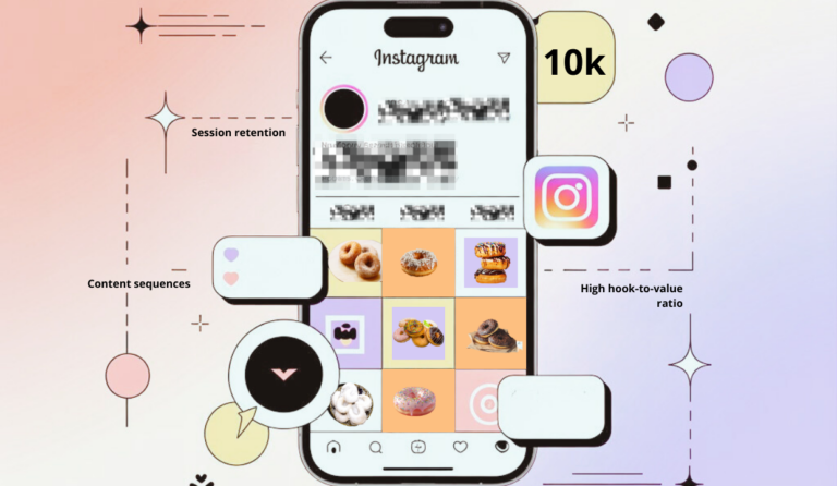
Platforms like Instagram have standardized content dimensions (e.g., 1080×1080 pixels for square posts), leading creators to design within these confines. This uniformity can result in feeds that look strikingly similar.
While consistency is essential, over-reliance on standard templates can make your brand indistinguishable from others.
Even the most creative brand must squeeze visuals into a handful of shapes:
| Orientation | Recommended Instagram feed size* |
| Square | 1080 × 1080 px (1:1) |
| Portrait | 1080 × 1350 px (4:5) |
| Landscape | 1080 × 566 px (16:9) |
*Instagram’s 2025 guidelines (Buffer)
Because every Canva template is built on these same dimensions, many accounts default to identical grids.
Fix:
- Exploit edge‑cases. Use full‑bleed portrait 4:5 photos for stop‑scroll presence—few brands bother.
- Rotate formats. Alternate square tips, vertical storytelling slides, and occasional panoramas to make your grid breathe.
- Develop a Signature Style: Establish a distinct visual identity through consistent color schemes, typography, and imagery.
3. Templates and Tool Fatigue
The convenience of design tools like Canva has led to widespread use of pre-made templates. While efficient, this practice can result in generic-looking content.
One million Canva users downloaded the exact same “minimal beige quote” layout in 2024 (Canva data). Stock templates compress creative variance, and drag‑and‑drop makes cloning effortless.
Fix:
- Start every campaign in an Instagram feed mockup file with your own brand fonts and accent colors locked in a style guide layer.
- Build a private template library so your posts remain consistent yet unmistakably “you.”
4. Risk Aversion in Branding
Many teams treat brand guidelines like constitutional law—logo lock‑ups, two‑color palettes, and siloed approval chains make even minor design pivots feel risky. When deadlines loom, marketers default to “safe” templates that have performed decently in the past. Layer the algorithm on top (it boosts already‑popular styles) and sameness becomes self‑reinforcing.
Meanwhile, user attention keeps shrinking: the average person scrolls social feeds 2 hours 23 minutes per day (DataReportal 2024). Brands know attention is scarce, so they copy proven formulas instead of experimenting—leading to copycat carousels and recycled meme formats.
Over‑reliance on tried‑and‑true visuals can erode distinctiveness. In competitive niches (think DTC skincare or SaaS dashboards), customers struggle to remember who posted what, which dilutes brand equity and drives ad costs up as you fight to stay top‑of‑mind.
Fix:
Adopt a “sandbox clause” in your brand guide. Use the 70‑20‑10 rule:
- 70% reliable content pillars
The reliable, on‑brand posts your audience already loves.
Examples: staple tips, product highlights, FAQs, brand stories.
Why: anchors your feed in familiarity and sustains baseline engagement.
- 20% iterative improvements
Small experiments layered onto those proven pillars.
Examples: same topic in a Reel instead of a static image, fresh color accent, shorter caption tone.
Why: reveals which incremental changes lift results without straying too far off‑brand.
- 10% moon‑shot experiments that might flop but could differentiate you dramatically.
Bold, high‑risk ideas with breakout potential.
Examples: unexpected meme, AR filter, radical color palette, cross‑brand live stream.
Why: injects novelty, counters algorithm fatigue, and can spark viral reach.
5. Production Speed Over Originality
The demand for frequent content updates pressures creators to prioritize quantity over quality, often leading to repetitive designs. Agencies often deliver 30 posts in under two hours. The easiest path? Plug assets into cookie‑cutter grids.
Rapid production can compromise creativity, resulting in uninspired content that doesn’t resonate with audiences.
Fix:
Adopt a social media feed design workflow where concept comes first:
- Narrative hook (what story or insight drives the post?)
- Visual sketch in Figma or Adobe Express.
- Copy overlay that amplifies the main takeaway.
This reverses the common “template first, edit later” approach that breeds sameness.
6. Platform‑Driven Aesthetic Trends
Platforms often promote specific content styles (e.g., short-form videos), influencing creators to adopt these trends to gain visibility.
Meta’s 2020 internal study found users spent less time on Instagram when chronological feeds were restored; algorithmic ranking kept engagement higher. To maximize retention, ranking systems surface the formats that spike dwell‑time, currently text‑over‑video and fast‑cut Reels, so everyone piles on.
While aligning with platform trends can boost reach, overemphasis can lead to a loss of brand identity.
Fix:
Lean into under‑indexed features (e.g., Guides, collaborative carousel posts) while competitors fight for attention in crowded formats.
7. Homogeneous Stock Imagery
The oversaturation of stock visuals, especially lifestyle imagery, has made social feeds feel visually repetitive. Flat-lay aesthetics, latte art, and overhead desk shots are reused endlessly across industries, eroding brand distinctiveness. While platforms like Getty, Unsplash, and Pexels offer convenience, they also make it easy for multiple accounts to unknowingly use the exact same visuals.
Fix:
Plan micro photo shoots with props and settings that reflect your real brand identity, or use AI-generated imagery with custom prompts tailored to your niche. Avoid generic assets by focusing on textures, lighting, and environments that feel proprietary. Originality in your social media feed design starts with visuals no one else can replicate.
8. Planning Tools Used Poorly
An effective Instagram feed planner (e.g., Planoly, Buffer, or Notion boards) helps creators preview grid cohesion. Yet many treat planners purely as scheduling calendars, not as creative sandboxes.
Fix:
- Drag drafts around until color balance, negative space, and post sequencing feel cinematic.
- Simulate three future rows before publishing anything new to maintain intentional rhythm.
9. Follower Feedback Loops
Creators often replicate content that previously performed well, leading to a cycle of similar posts. When one post type spikes likes, creators double down, narrowing stylistic range. Over time the feed calcifies. This repetition can cause audience fatigue and hinder the discovery of new, potentially successful content formats.
Fix:
Track saves, shares, and watch‑time, not just likes. These metrics often reward deeper storytelling, encouraging novelty instead of superficial repetition.
Practical Framework: The “3‑Layer Feed”
A lack of structured content planning can result in a feed that feels chaotic or inconsistent. A well-organized feed enhances user experience and reinforces brand messaging.
Borrowed from magazine art direction, this method keeps feeds dynamic without sacrificing coherence:
- Foundation Layer (Evergreen visuals). Brand patterns, color blocks, and typography that repeat for instant recognition.
- Feature Layer (Storytelling modules). Interviews, user‑generated content, behind‑the‑scenes—swap formats weekly.
- Highlight Layer (Trend hijacks). Timely memes, reactive Reels, seasonal campaigns.
Mapping ideas in three layers inside your planner prevents both disarray and copy‑paste homogeneity.
Quick‑Start Checklist
- Audit last 30 posts: tag duplicate layouts.
- Define one risky experiment per content pillar.
- Mock up upcoming nine‑post grid in Figma.
- Resize creative to optimal Instagram feed size specs before exporting.
- Schedule via your chosen planner and set reminders for mid‑campaign pivots.
Conclusion
Yes, algorithms prefer sameness, but humans crave novelty.
By re‑thinking your social media feed design, leveraging diverse social media feed design ideas, respecting technical constraints like correct Instagram feed size, prototyping via an Instagram feed mockup, and stress‑testing layouts in an Instagram feed planner, you can restore freshness to a sea of look‑alike grids.
Break the pattern intentionally, your audience (and the algorithm) will reward you.